How do you get temperature from a wind profiler?In addition to being able to report the winds, our profiler is equipped with RASS -- a Radio Acoustic Sounding System. Essentially, for 5 minutes out of every hour, our profiler emits audible sound waves into the atmosphere, and the profiler then listens to the sound waves that are reflected back through a receiver. Based on how the sound is reflected back towards Earth, it can then calculate a virtual temperature profile of the atmosphere.
What's the difference between temperature and virtual temperature?Unlike temperature, which is simply whatever temperature it happens to be outside, virtual temperature is something slightly different. Calculating temperature remotely from the ground is also surprisingly difficult. Virtual temperature, however, can be calculated more easily. Known as Tv for short, it is defined as: Think of it this way: imagine taking a random chunk of the sky and putting it in a box where it can't interact with the rest of the atmosphere. This would be called a parcel of air. Now, just like all the air in the atmosphere, our parcel contains a given amount of moisture (water droplets). Now, depending on how much moisture is in the air, the parcel is going to have a different density of molecules, and would have a slightly different temperature. What virtual temperature is then, is the temperature that our air parcel would be if it had no moisture content at all, but still had the same pressure and density. The point: virtual temperature isn't usually very different than actual temperature, so it can be used in approximating the temperature at different levels in the atmosphere rather nicely without having to launch a weather balloon. Additionally, virtual temperature is directly used in calculations of CAPE, Convective Available Potential Energy, which is an important calculation for figuring out how much energy is in the atmosphere that thunderstorms could use for development. Our RASS system typically will gather temperature data from near the surface up to around 1,200 meters (~3,900 feet, or about 3/4 of a mile).
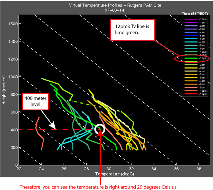
How to Read the Virtual Temperature Plot:
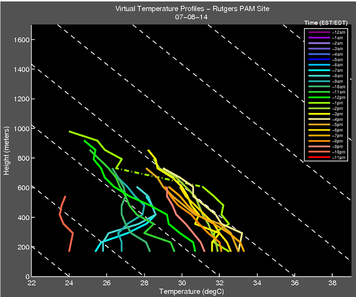
Example: Say you wanted to know what was the virtual temperature at 400 meters above the ground was at 12pm on July 8th, 2014?
For reference, here is the plot in question...
So then, in order to find the answer to the example...
How come some parts of the colored lines are in a dash-dot pattern?
The colored dash-dot lines represent interpolated data. As explained on the wind profile page, the instrument isn't perfect, and sometimes it doesn't get an accurate reading from a particular level. In the case that 1 or more points are missing, the dash-dot line is used to connect the data that was recorded above and below the missing levels. What do the magenta dashed lines in the background of the graph represent?
The magenta dashed lines represent the standard atmospheric (or environmental) lapse rate of 6.49°C per kilometer (5.5°F/1000 ft.) for different temperatures. The standard atmospheric lapse rate is the average rate at which the temperature decreases as you travel higher into the atmosphere. From this, you can identify the basic structure of the atmosphere. For example: if you can see from the lines that temperature is increasing with height, then a temperature inversion is present. If temperature is decreasing more quickly than the average rate, that is what is called an unstable atmosphere and could mean the atmosphere is conducive for thunderstorm development. You can tell this based on whether the colored lines are following the white dashed lines pretty well (stable), going towards the left more (unstable), or going to the right more (inversion). What do the white dashed lines in the background of the graph represent?
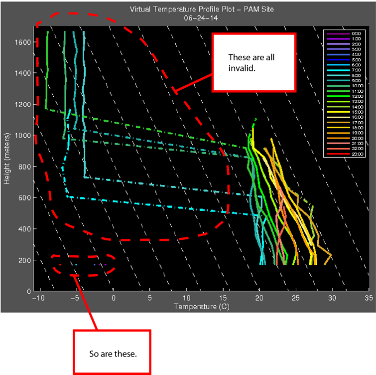
The white dashed lines represent the dry adiabatic lapse rate of of 9.8°C per kilometer (3.5°F/1000 ft.) for different temperatures. The dry adiabatic lapse rate is the rate at which an unsaturated parcel of air warms of cools when moving vertically through the atmosphere. The actual stability of air is figured out by comparing the standard atmospheric lapse rate with the dry adiabatic lapse rate. If the parcel is cooling more slowly than that standard atmospheric lapse rate, the parcel is considered to be unstable. Could there be an error on this chart?
Yes.The data from the profiler that is graphed on this website is the RAW DATA as it's coming from the instrument. Like most equipment, while very reliable, it's not completely perfect, and occasionally an errant point or two slips through. Usually though, the errors are easy to spot.
If you see a dramatic jump that doesn't seem to make any sense, chances are it's an error. Additionally, if a profile from a certain time contains only one point, chances are it's also probably not very accurate.
If you have any additional questions, please contact the webmaster for this site and he will be happy to assist in any way he can.
|